Just like choosing the right materials, furniture and colours that will give your restaurant the aesthetically pleasing vision you’ve alway had in mind, before any of this can go ahead for smaller businesses, you’ll need to fully understand the concept of growing your company and potentially implementing the use of technology within your business, which is why looking into this POS blog will give you a head’s start when it comes to your restaurant’s business operations. Once this is all established, as time goes on, you’ll probably want to consider the renovation of your restaurant’s interior design.
When it comes to this, there are many elements to take into consideration when designing a restaurant. The most successful restaurants are a combination of great food, great service and attractive interiors. First port of call when we design in a restaurant is the client. We like to learn as much as we can from them and how they see their restaurant running. What is the menu, what is the envisaged style?
Concept
The interiors concept should always provide an appropriate back drop to the food. Modern Italian cuisine? We don’t need to see pictures of rolling Tuscan hills, think past that and onto palettes and textures pulled from the colours of the region. Up-market burger joint? Move past the clichéd retro vibe or the over done industrial trend. If you are serious about carving a niche out for yourself in the competitive restaurant industry, you must present confidently with all aspects of your restaurant well thought out and meticulously planned. Know your market, know your food, and understand the interior trends.
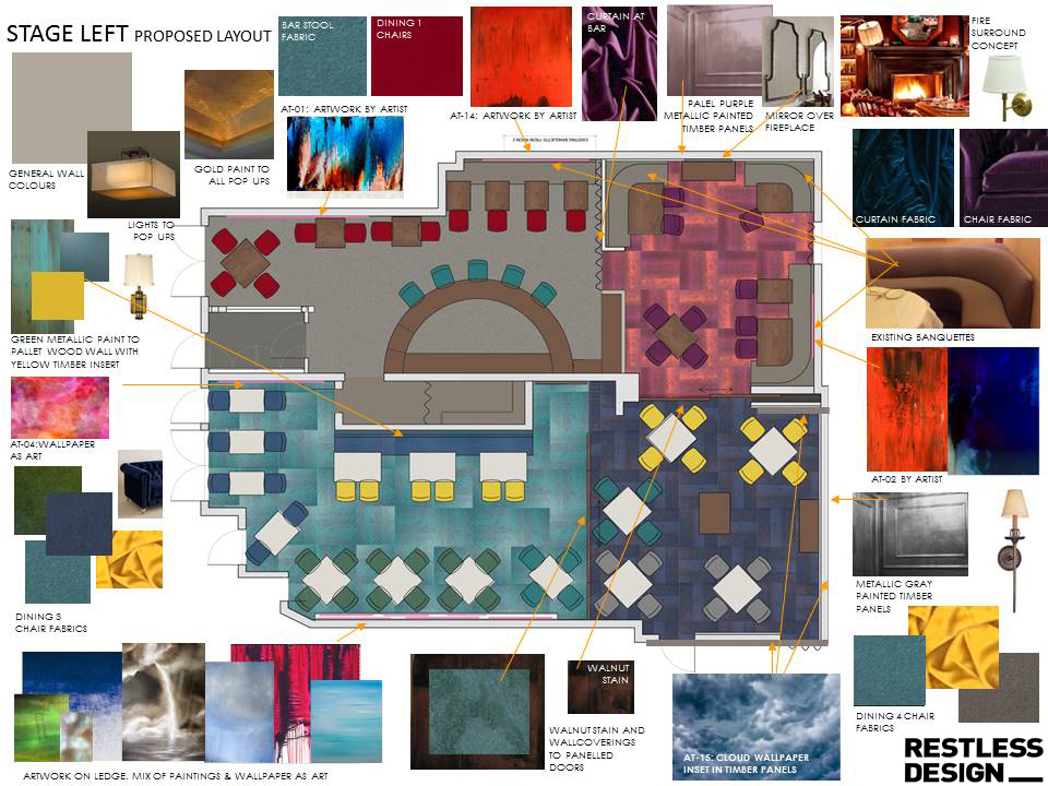 Restless Concept Board for Stage Left
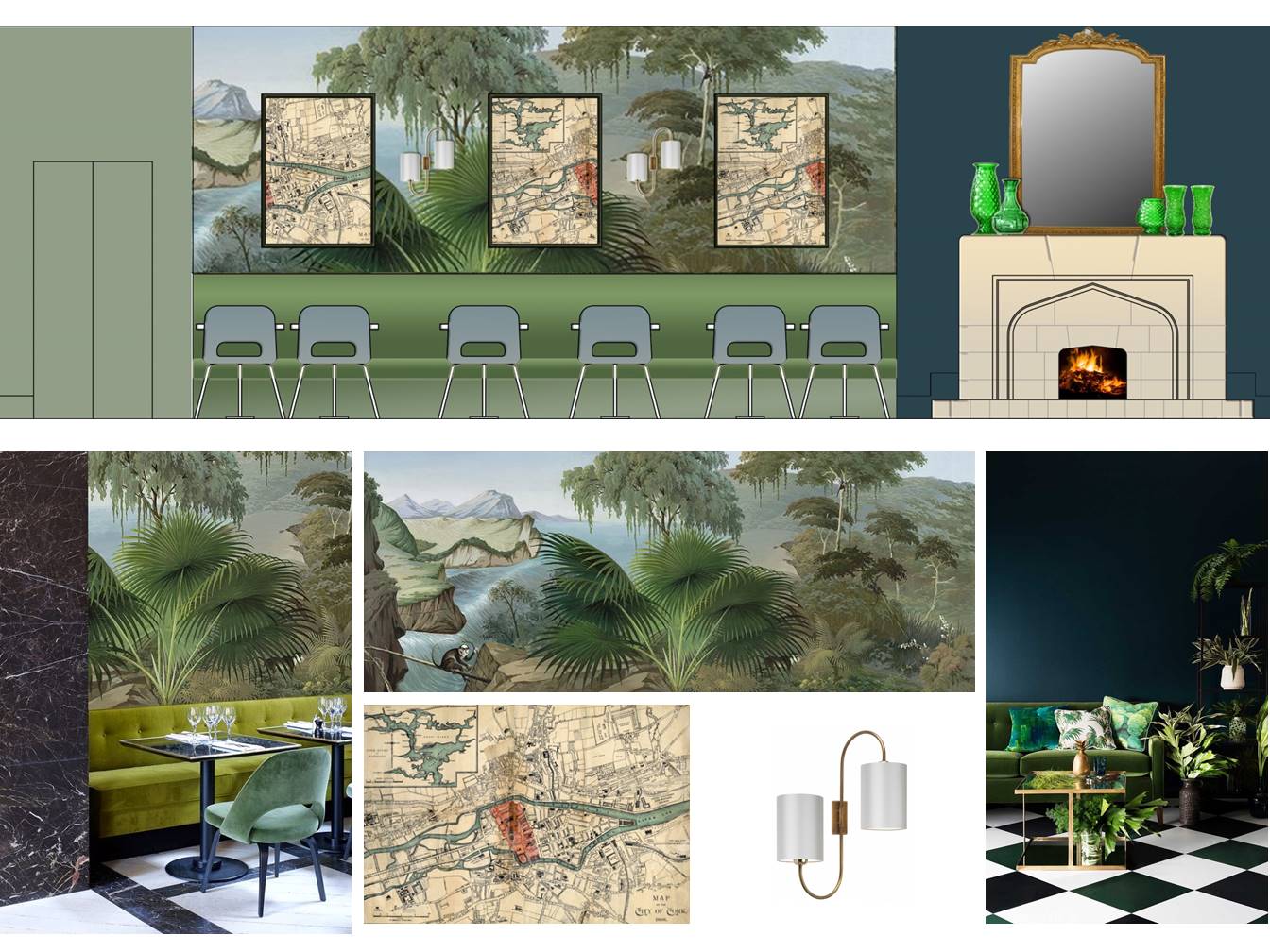 Restless Concept Board for The Castle
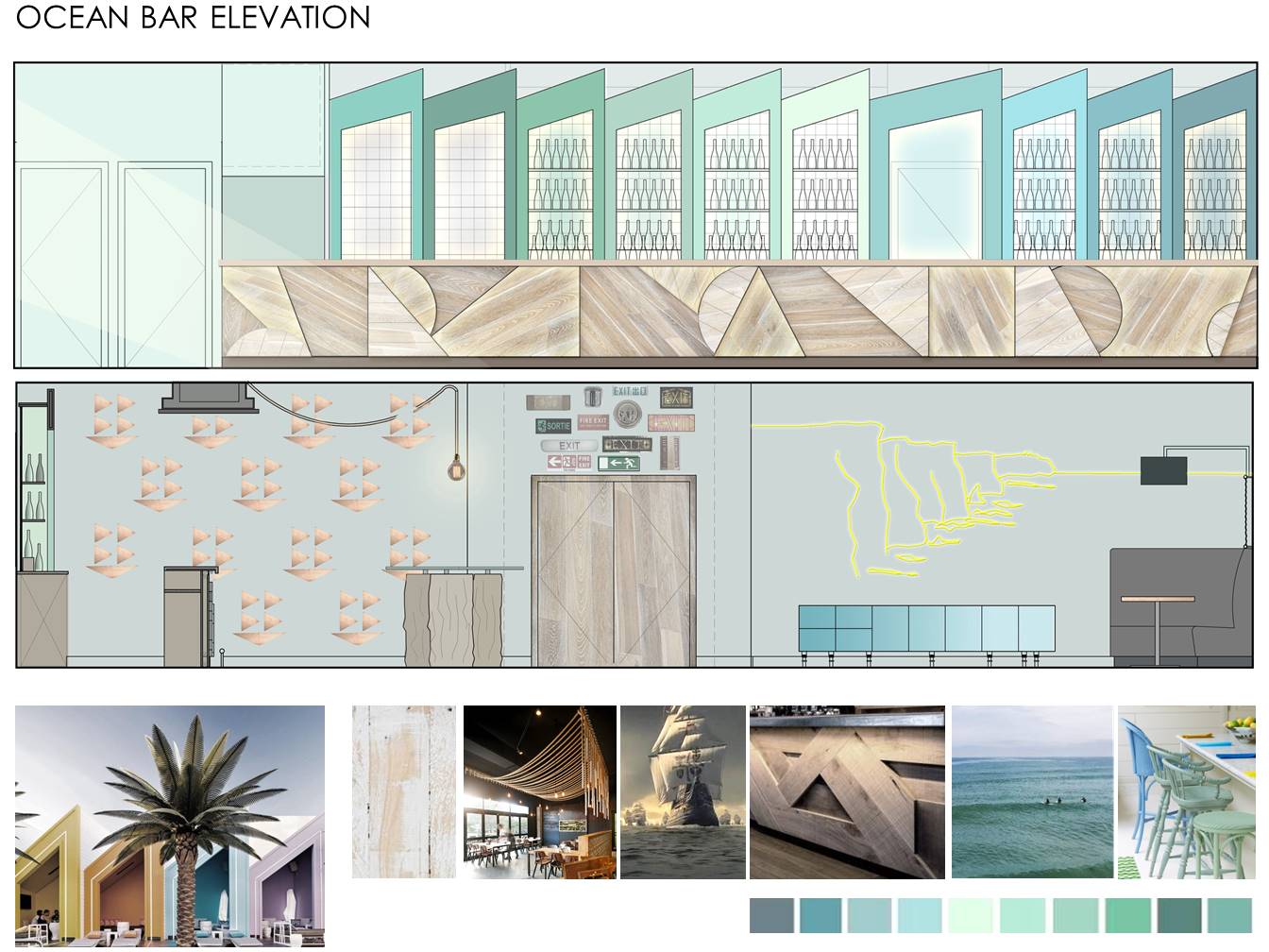 Restless Concept Board for The Ocean Bar
Budget
A question we always ask the client in the initial briefing for a new restaurant project is, how many bums on seats do we need? The next question typically is, what is your budget? It is very important to understand your budget and what it can get you. 100k, for example, is a lot of money to anyone but if you are fitting out a restaurant from scratch you would be surprised at how quickly this gets eaten up with kitchen equipment, mechanical and electrical requirements etc. That is not say it’s impossible to create an appropriate and exciting interior on a small budget but once you start a renovation project money can fly out the door pretty quickly without a good handle on the costs. The more prepared you are, the more cost efficient your project becomes. Measure twice, cut once as they say.
If your budget is really limited , costs should be funnelled toward elements where revenue is generated. Decent comfortable seating that will last, quality tableware and great lighting. Those three elements combined with great food and service is hard to beat.
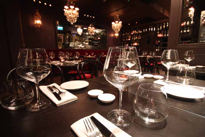 Restaurant by Restless La Rouge
Layout
The architecture of your space is hugely important. Ample space should be allowed for all of your back of house requirements, including your kitchens, bathrooms, etc. Once you have established the maximum front of house area required for your dining |bar experience you need to consider how your customers will move through the space and just as importantly, how your staff will also.
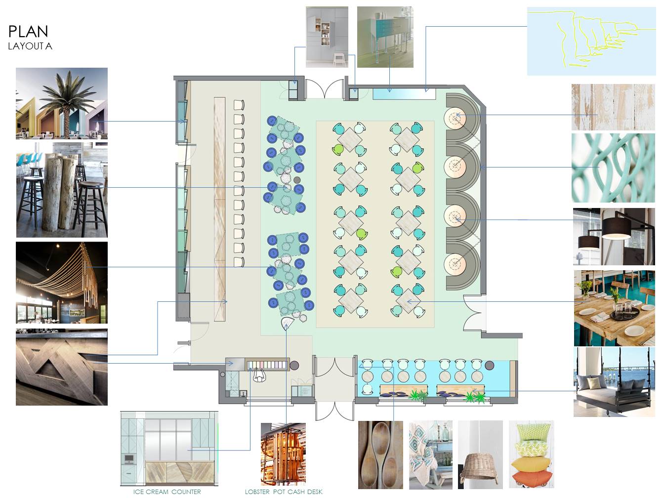 Restless Concept Board Ocean Bar
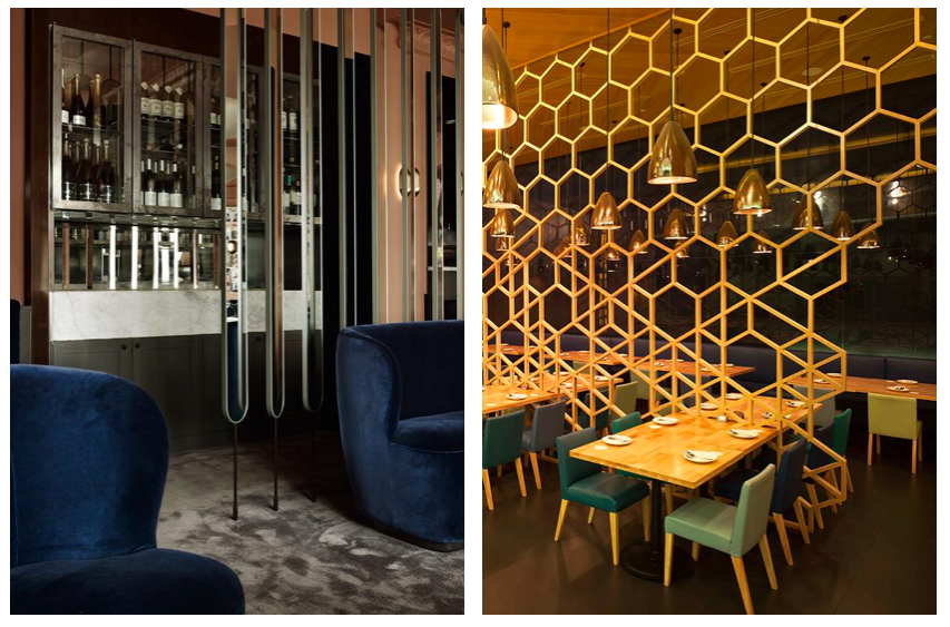
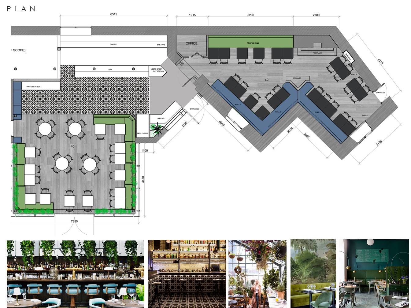 Restless Concept Board for The Castle
The dining area should flow from the lobby to the bar to the tables. Screens and partitions can generate opportunities for large parties but also create more intimate locations for parties of two for example. In many cases, a healthy combination of booths, tables and more private spaces give the best chance to maximize revenue and maintain flexibility.
Your bar is a great opportunity to create some theatre in your interior. A nicely lit well designed bar quite becomes the pivotal point around which the design concept evolves. Your bar should provide a beautiful engaging back drop to your busy restaurant.
In summary, your layout should move customers and staff through your space easily and without bottle necks. A well planned space will have a strong impact on the customer and your ability to serve them.
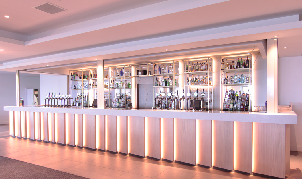 Restless designed bar in The Atlantic Suite – Armada Hotel
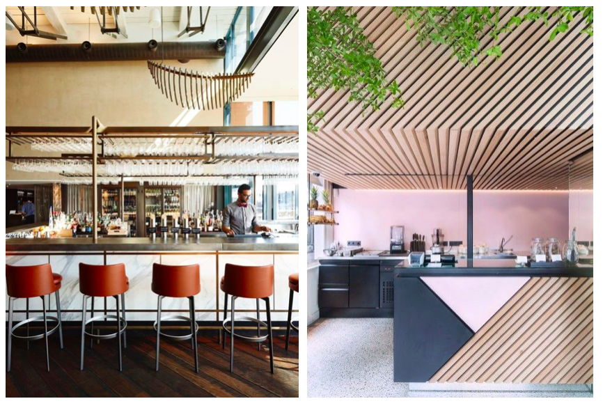
First impressions
Your shopfront, entrance and lobby are the first and last impressions your restaurant makes. This area needs to be inviting, it is the physical advertisement of your business. It should always reflect your brand in terms of look, style and character.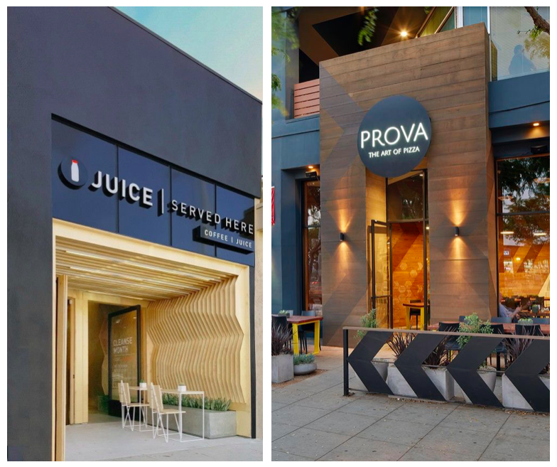
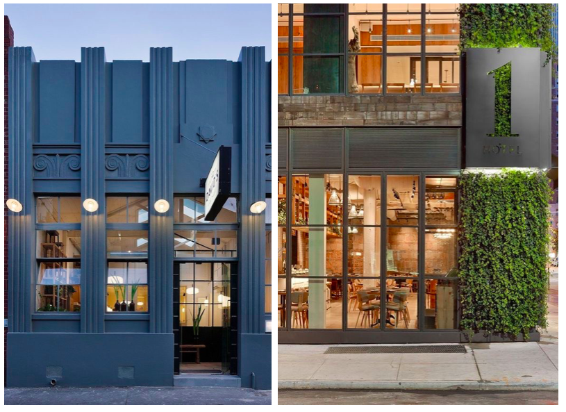
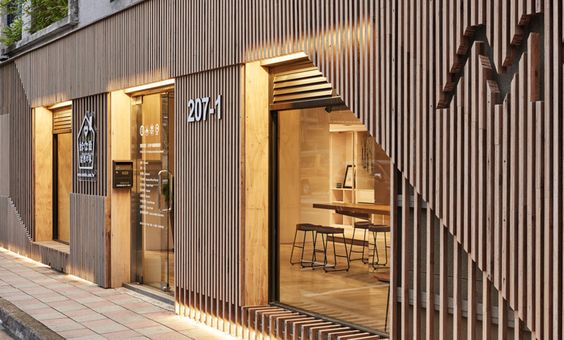
Views through your front windows should be maximised where possible. Entrance doors should be well maintained & easy to open. If you require a waiting area make sure it’s well considered and fit for purpose.
Ambience & Décor
The style and attitude of your food should translate to your ambience and décor, every facet of a restaurant should support each other. If your food simple and beautifully presented, perhaps your style is upscale casual? Your materials here would feel high-end, sumptuous but subtle. Do you want an exhibition kitchen where the theatre of cooking is all part of the experience? An example of materials for an interior like this would be stainless steel and dark timbers. Do you want your décor to be friendly and accessible? Maybe your style is engaging graphics and warm pallets. The décor needs to be a further extension of your brand and should always be considered in tandem with the style of food and interior layouts.
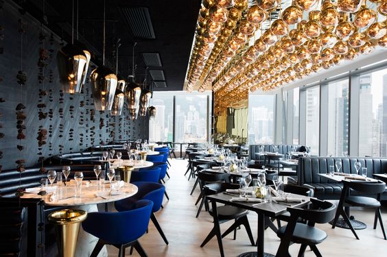
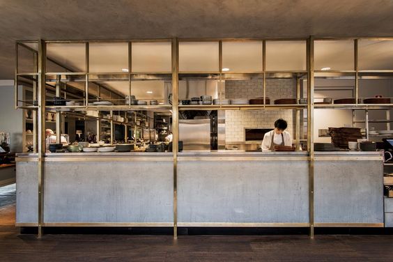 Hotel Centennial – Sydney
Lighting is crucial to a successful restaurant design. The colour temperature should feel warm, avoid cold, white light or blue white LED at all times. Depending on your opening hours, the transition from day to night should factor as a key part of your lighting design. Always make sure to correctly light the areas where people are walking and working. Bathrooms, corridors, access and egress points should always be well lit for health and safety reasons. On the point of health and safety, you may want to ensure that you have a first aid and AED kit in a designated area, as this could help in emergency situations. You can find information on how to make or find a first aid kid on the American Red Cross website and you can find an AED kit, by checking out this ZOLL Plus AED package.
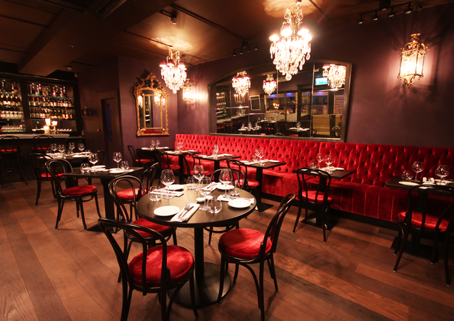 Restaurant by Restless -La Rouge
Details
Once you have decided on your menu, layouts, interior styling and décor, it is important to consider the details remaining that will always be customer facing. Your menus, signage and general graphics (business cards, website) should all link together graphically in a manner that translates your brand correctly. If you’ve not got a website or the website needs some updating then be sure to head over to these web designer in Liverpool who have great reviews and are highly recommended.
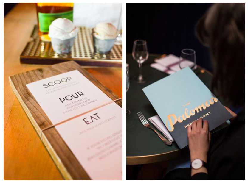
Your uniforms, tableware and cutlery should also be considered as part of the greater scheme. It is worth mentioning at this point that table size versus serving plate size can play a big role in the comfort of the dining experience. Your plates, serving bowls, etc should always sit comfortably on the table top with a bit of room to spare for wine glasses, condiments and sides.
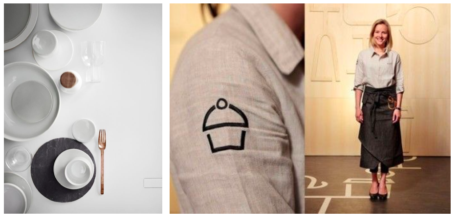
Music and sound system should never be an afterthought either. Playlists can be easily created to suit any mood from day to night, so take the time to do it. It is worth investing in a speaker system that helps spread the sound around the space. No one wants to sit beside a booming speaker. If the budget permits, there are plenty of recess ceiling mounted speakers on the market that are powerful and discrete.
Speaking of details, it is also important to make sure that you’re being the most efficient you can be with your outgoings as well. A friend recently told me that they got a great deal on their business energy through comparison websites similar to Usave. Because of this they managed to make a huge saving!
Front of house & back of house
Depending on your style of restaurant, the blending of your front of house and back of house may be less or more obvious. Perhaps you sell gourmet style Mexican street food, in which case it’s kind of cool to see some of your stock stacked on shelves from the dining area. Or as mentioned previously, you have an open kitchen in which case your chef and team are on display.
The transition from front of house (bar & dining area) to bathrooms etc, should always be fluid & consistent. The access to your bathrooms and the bathrooms themselves should represent the brand ideals presented elsewhere in your interior.
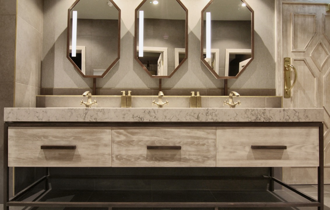 Bathrooms by Restless -The Market Lane Restaurant
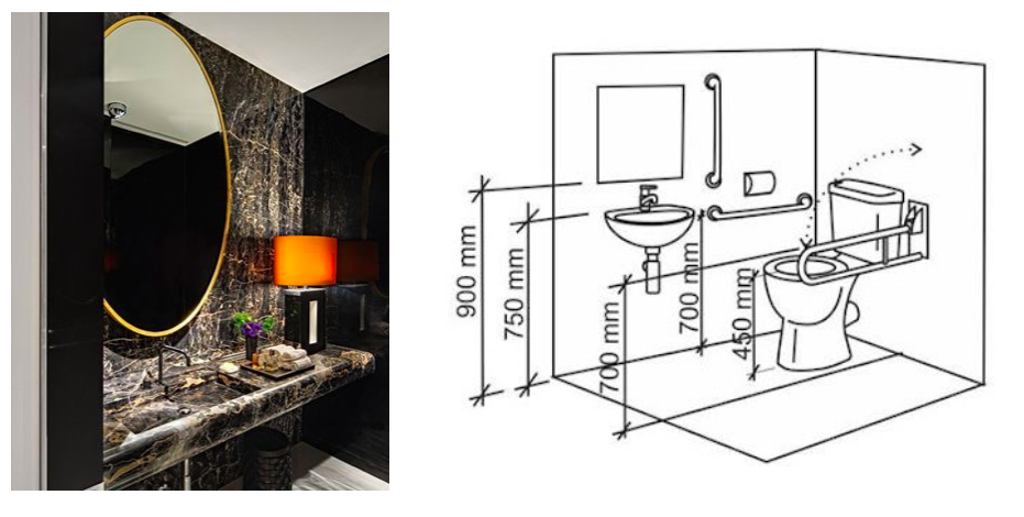
Compliant disabled access should be at the fore front of your mind even if you are not required to apply for a DAC (Disabled Access Certification), it is just good practice. Also where you can have unisex baby changing facilities, it’s not just the ladies wiping bums anymore folks so let’s get with the times!
Storage
Storage in restaurants is usually challenging and very important to get right.
Some things to consider are:
- Is your staff fully equipped to service your customers
- Is the staff satisfied with the layout of their equipment?
- How can you optimize the staffs working environment?
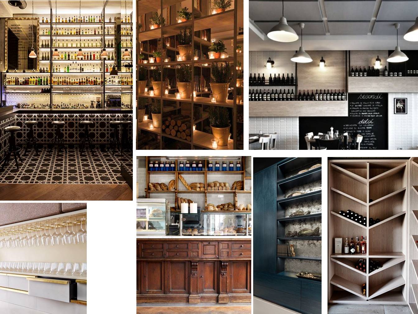 Restless Joinery Concept Board for The Castle
Ventilation
A correctly ventilated restaurant is fundamental to a successful space. If you require mechanical ventilation, enlist the services of a specialist, this is not something you want to mess around with. Consider how your customers will feel sitting next to or close to the main entrance or right beside the open kitchen. Ventilation is an important consideration in great restaurant design and illustrates exactly why design is so much more than beautiful aesthetics
By Aoife Rhattigan.
RESTLESS.DESIGN can help you with your refurbishment project.
Please contact our commercial team at 01-4309555 or email: [email protected] to discuss your requirements with us.
