It’s no surprise that art is great source of inspiration for interiors
We’ve rounded up a few of our favourite “Arteriors” for your to peruse.
The William Hotel, NYC
The William Hotel, a luxury boutique hotel based in Manhattan, is a delight to look at. The collaborative team aimed to create a livable three-dimensional painting and blur the lines between the three fields of architecture, interiors and art. Each of the five floors are a different colour; blue, teal, pink, green and orange. The colours encapsulate everything from the walls to the ceiling. Guests find themselves fully immersed in their surroundings and it’s the actual art in the interiors.
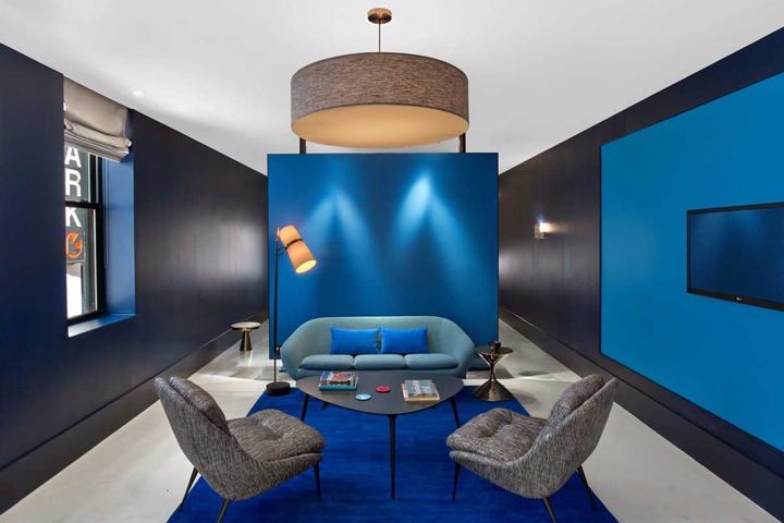
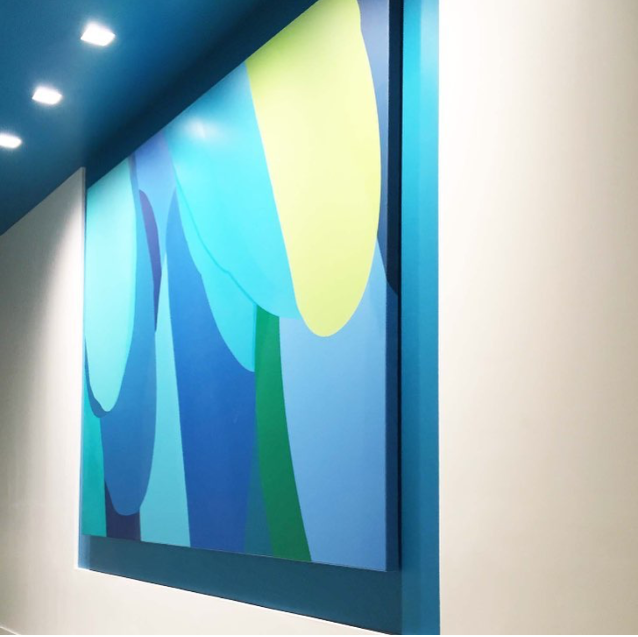
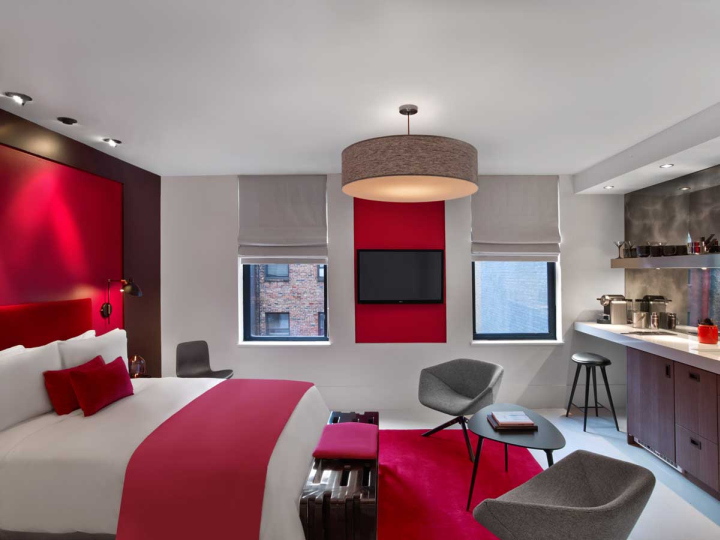
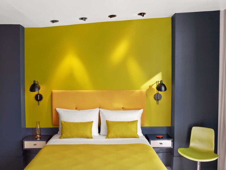
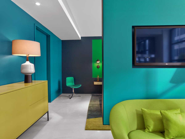
Photography by Eric Laignel and Eric Striffler
Hongkun Museum of Fine Arts
It should go without saying that an art museum’s interiors should be art-inspired! Whether it be neoclassical or art deco. The Hongkun Museum of Fine Arts in Beijing is a contemporary mix of modern technology and history. Penda designer, Chris Precht, states that the multiple archways are derived from caves, “For thousands of years, the cave has been used for making art and conserving history. We tried to find a new connection between ancient tradition and a contemporary way of exhibiting artwork.” Computer modeling was used to give curves radii ranging from 1½ to 10 feet and self-leveling poured concrete was used for the flooring.
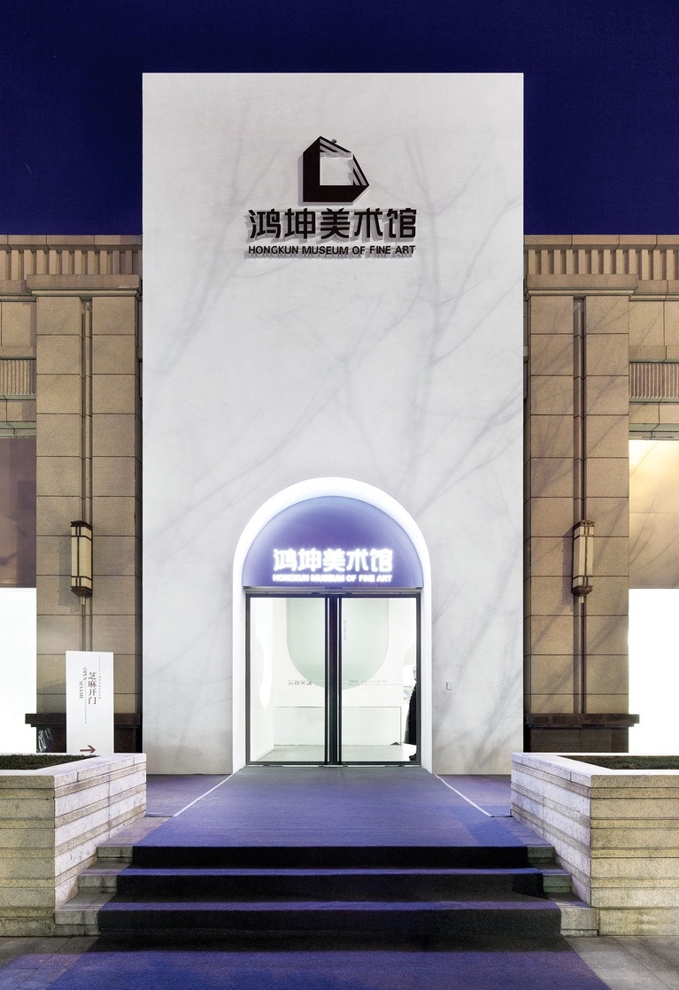
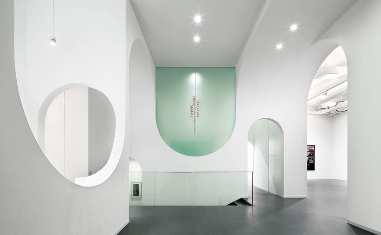
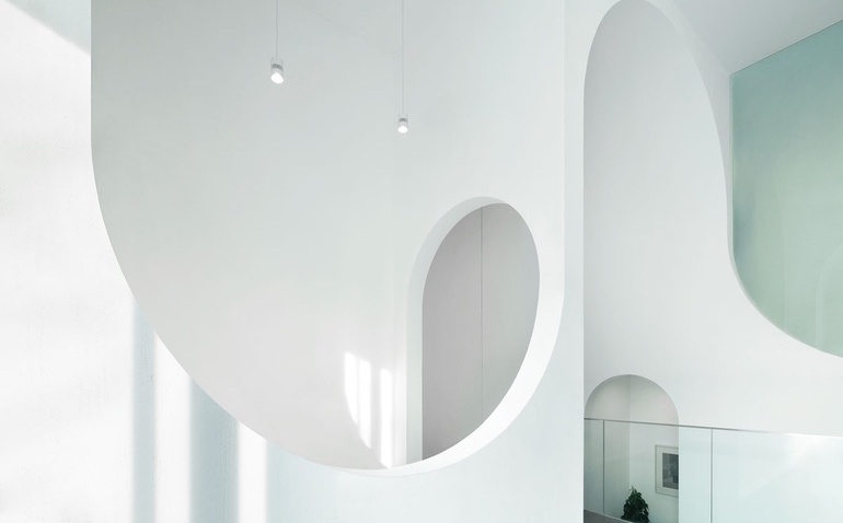
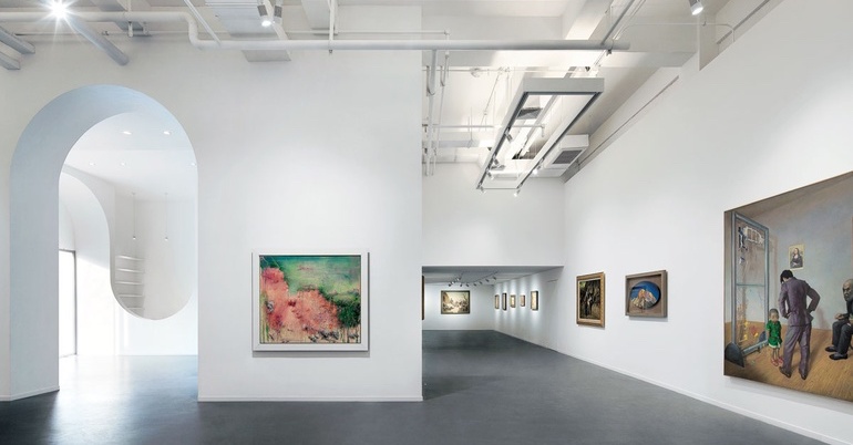 Photography by Xia Zhi
Melissa’s NYC Flagship Store
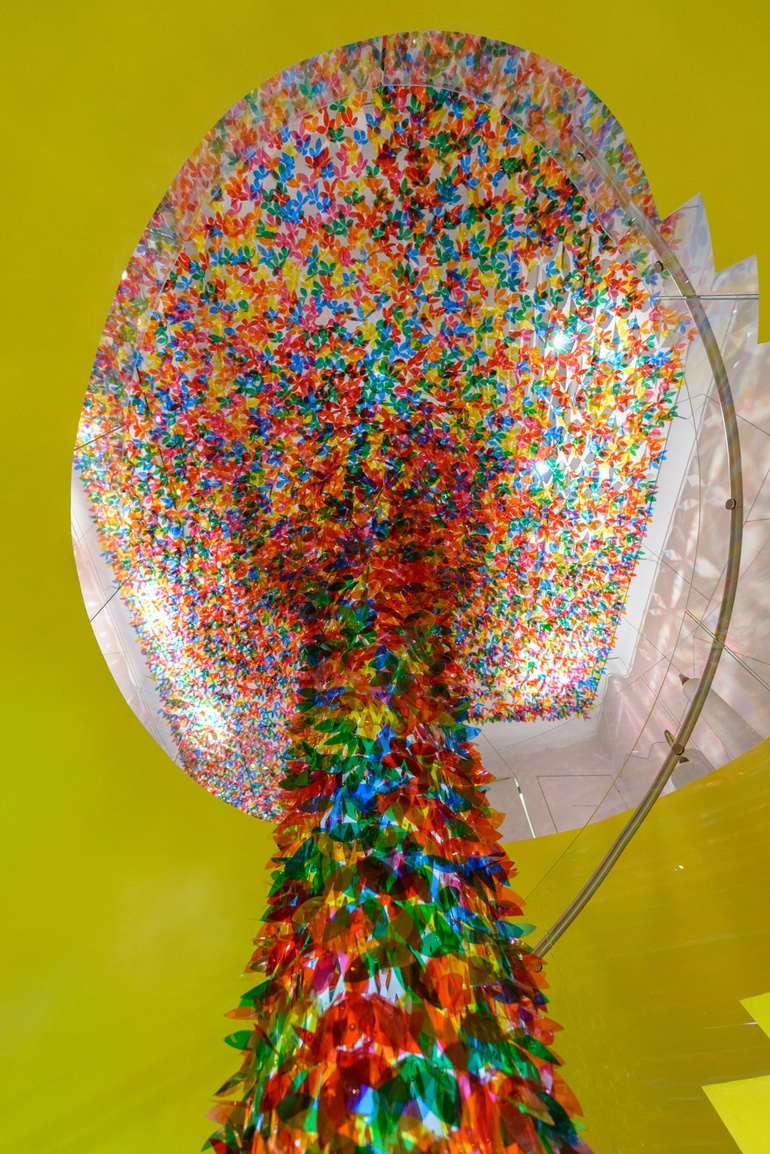
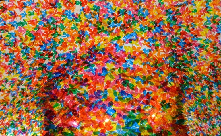
In 2014 shoe brand, Melissa, commissioned Softlab to design a temporary installation in their NYC flagship store in celebration of their new collection, We Are Flowers. The finished product was a structure of 20,000 laser cut polyester suspended blossoms! The installation completely transformed the 2,000 square foot space into a piece of art!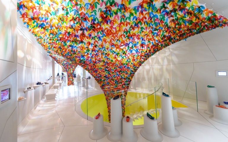
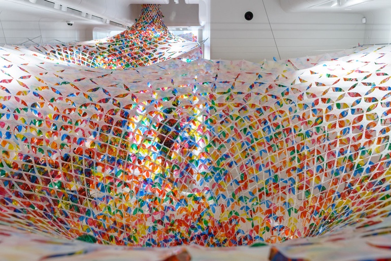 Photography by Alan Tansey
JWT Amsterdam Office
Advertising agency, JWT, is another mix of old and new. The agency dates back to 1864 yet you wouldn’t think that when seeing their office. Their mantra ‘Think, Do, Make” was at the forefront when creating the interiors as the building is split into different spaces for just that. A relaxing garden and library for ‘thinking’, a busier city setup for ‘doing’ and a creative studio for ‘making’. The walls are littered with a mix of catchy slogans, beautiful wall art and loud graphics. The walls and commercial ceiling tiles are white to make it feel big and spacious and to compliment the pops of colour. Empty spaces are contrasted with unusual installations and classic furniture from the likes of Eames and Friso Kramer.
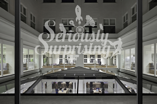
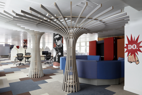
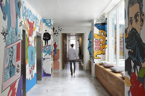
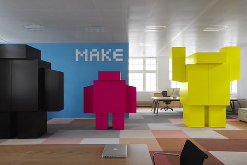 Photography by Kasia Gatkowska
Hôtel Vernet, Paris
François Champsaur was given a simple brief when commissioned to oversee the renovation of Paris hotel, Hôtel Vernet, he was told to “Do something Parisian”. He was inspired by the city’s recent ‘renaissance of creativity’ and all the artists, artisans, designers and architects that it held. The hotel is filled with custom made furniture and artwork by contemporary French artists.
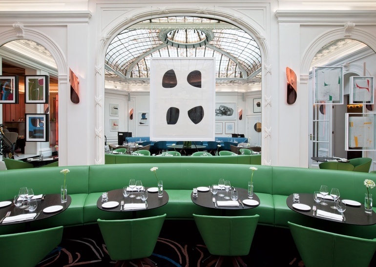
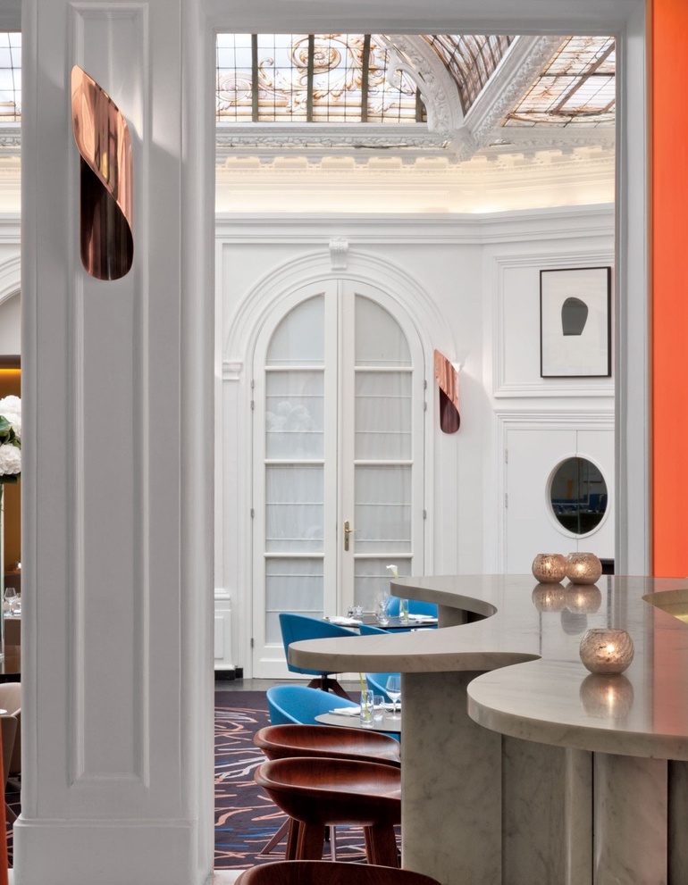
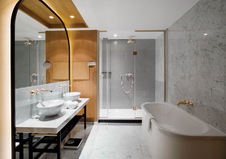
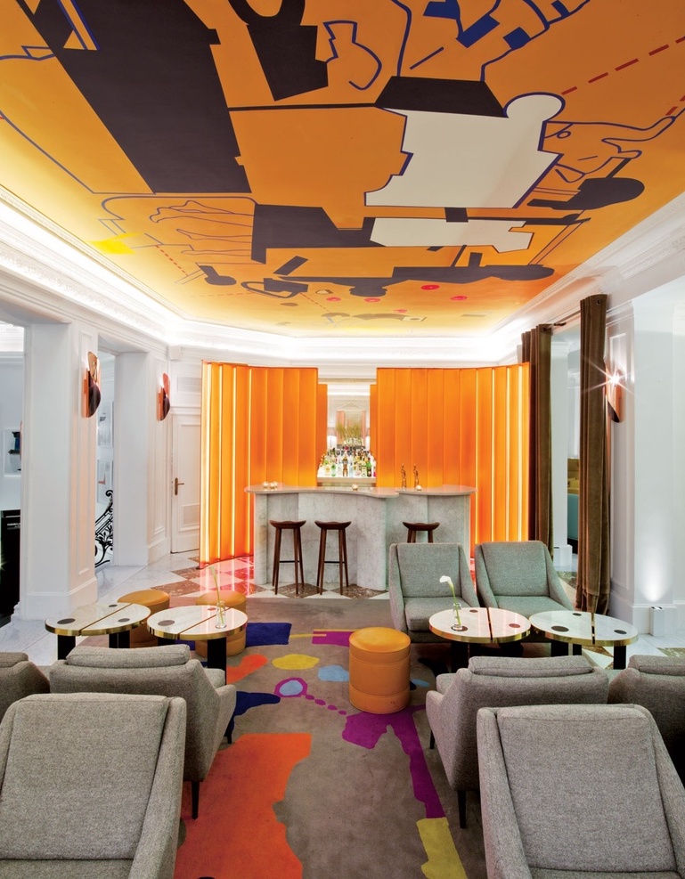
Photography by Eric Laignel
Our work – Restless.Design Arteriors
Here at Restless.Design we also get inspired by art and enjoy incorporating it into our designs and interiors. Some examples of our work where art is a pivotal element of concept are , Peter Mark College, Stage Left and The Kerns Residence.
Peter Mark College, Dublin
The Restless.Design team were involved in the redesign of Peter Mark, College Hairdressing & HR Offices. Art played a major role in the concept for the interiors. We were not limited to the walls here, the art grabs you from the ceiling, across walls & furniture. Those looking for a bold new look in their premises may want to consider using chroma panels to really create something unique.
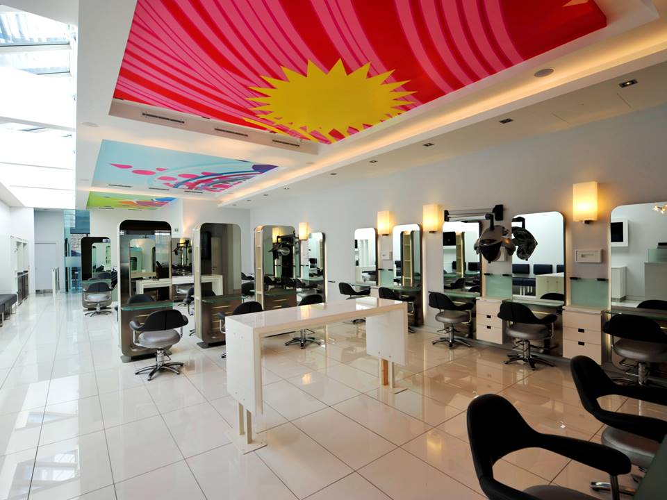
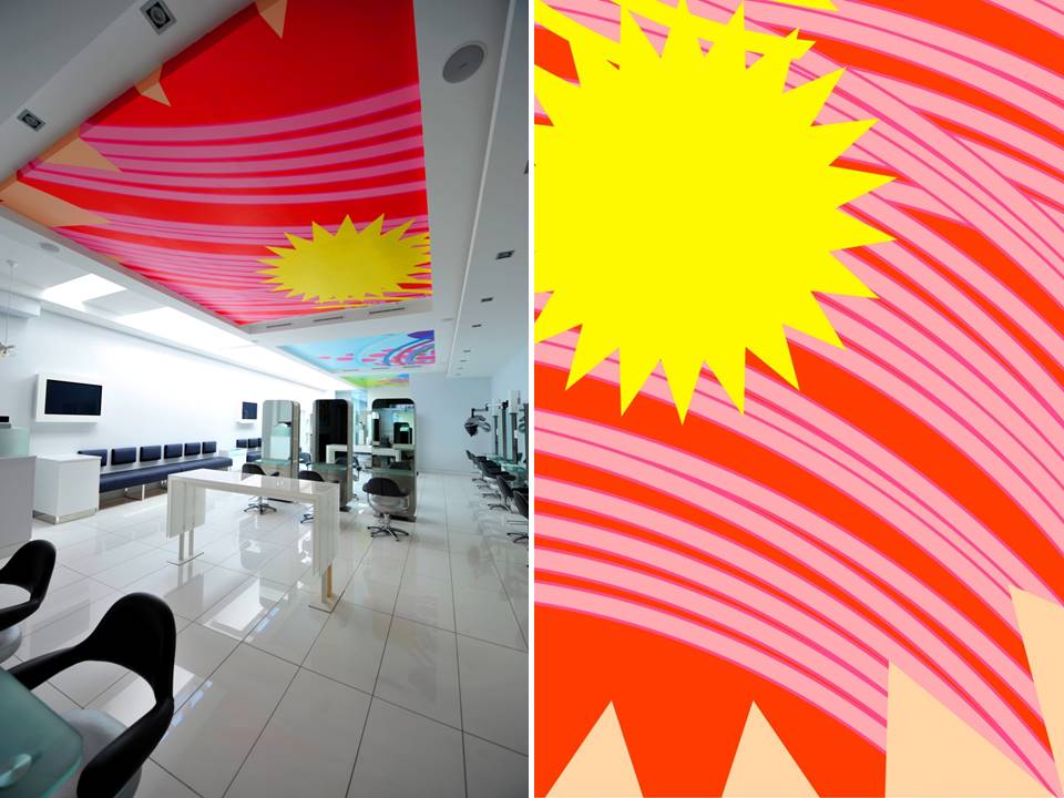
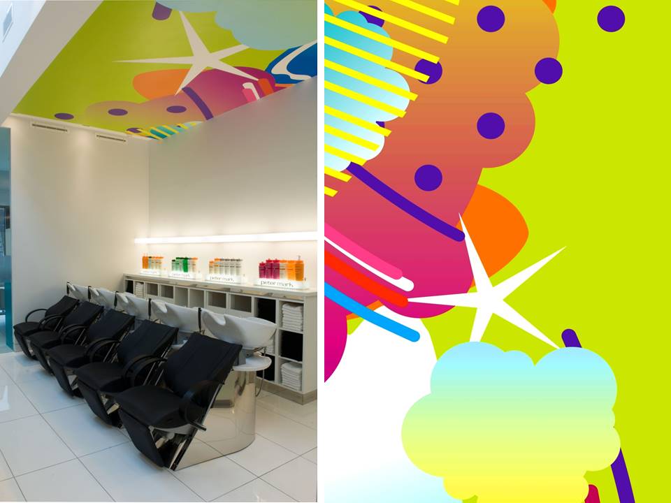
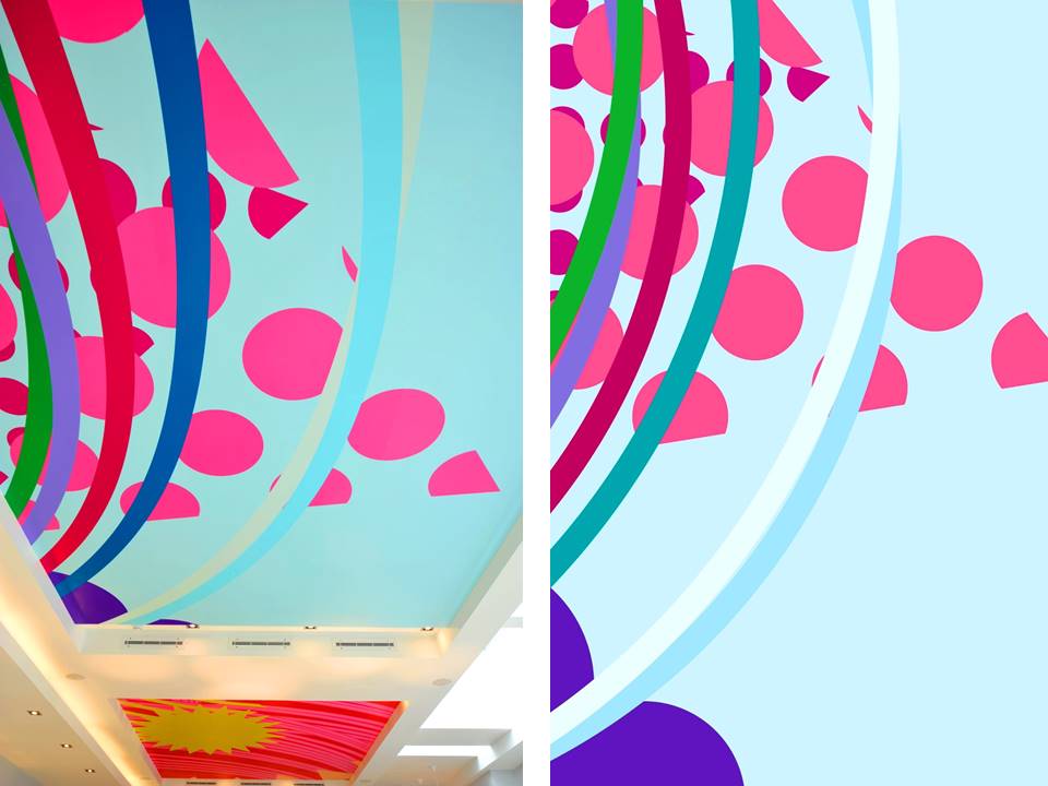
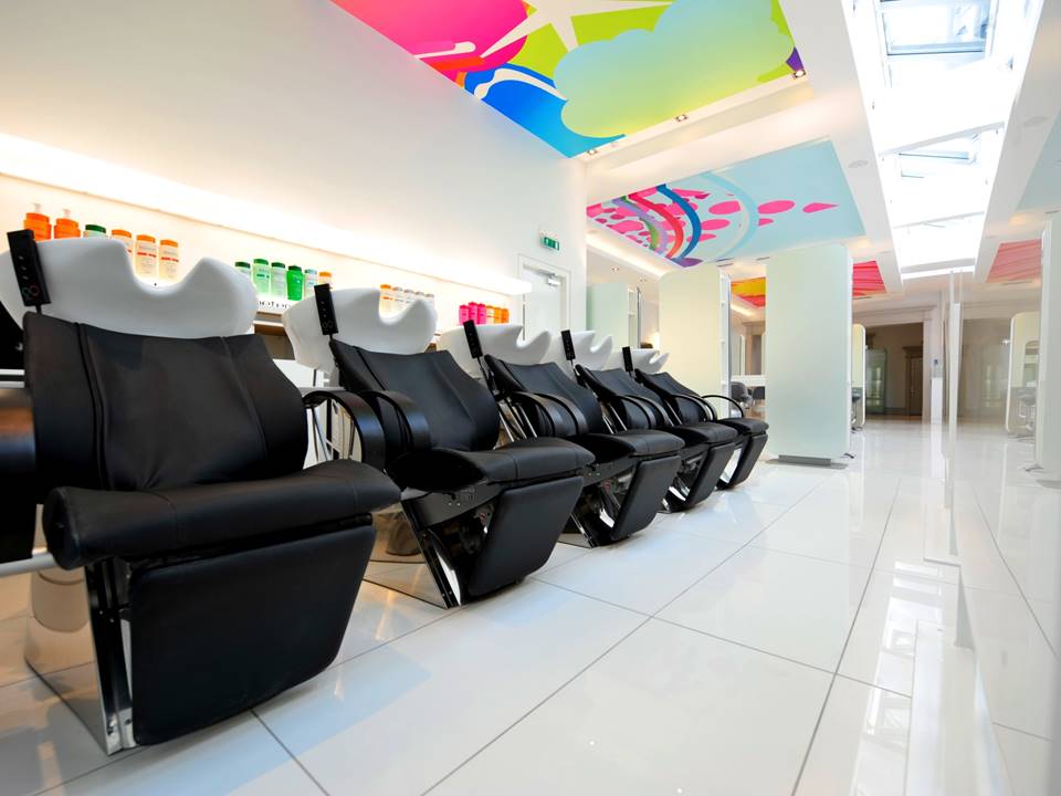
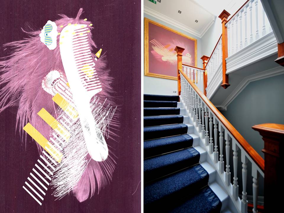
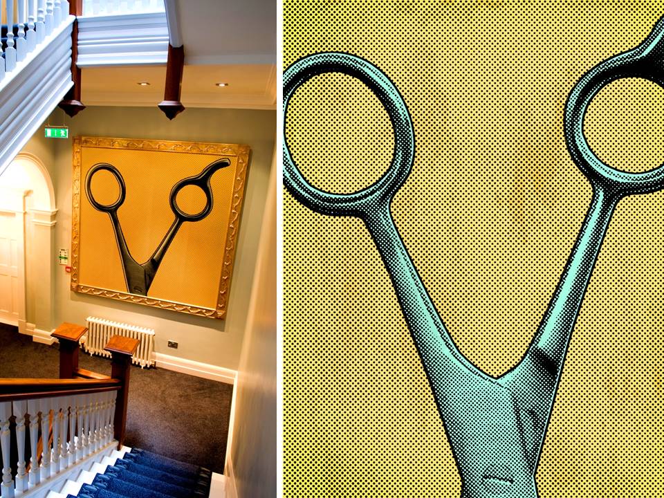
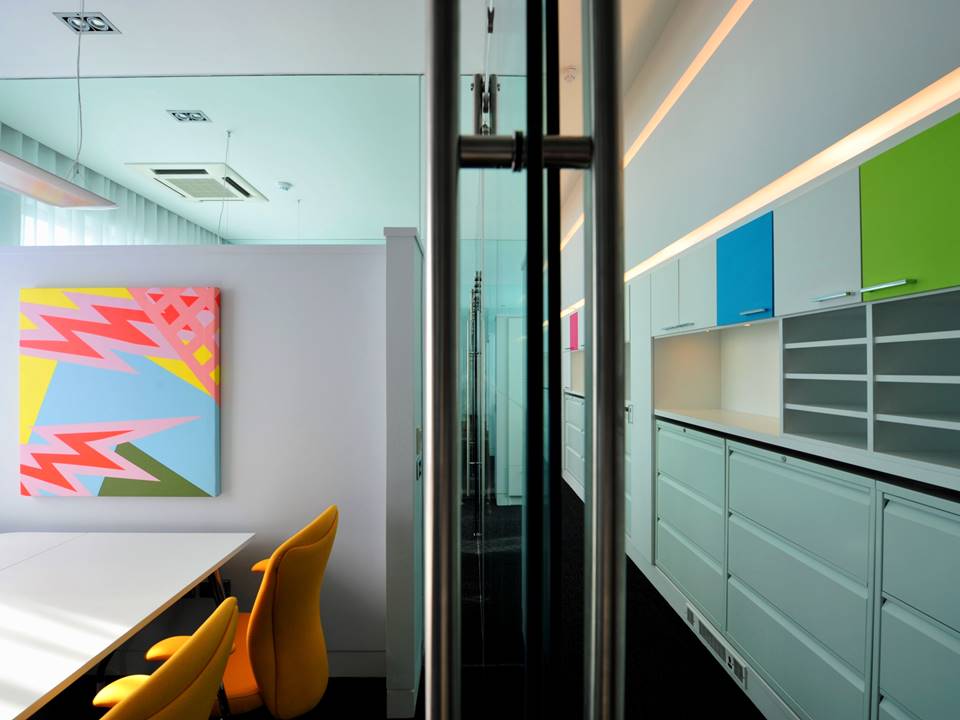
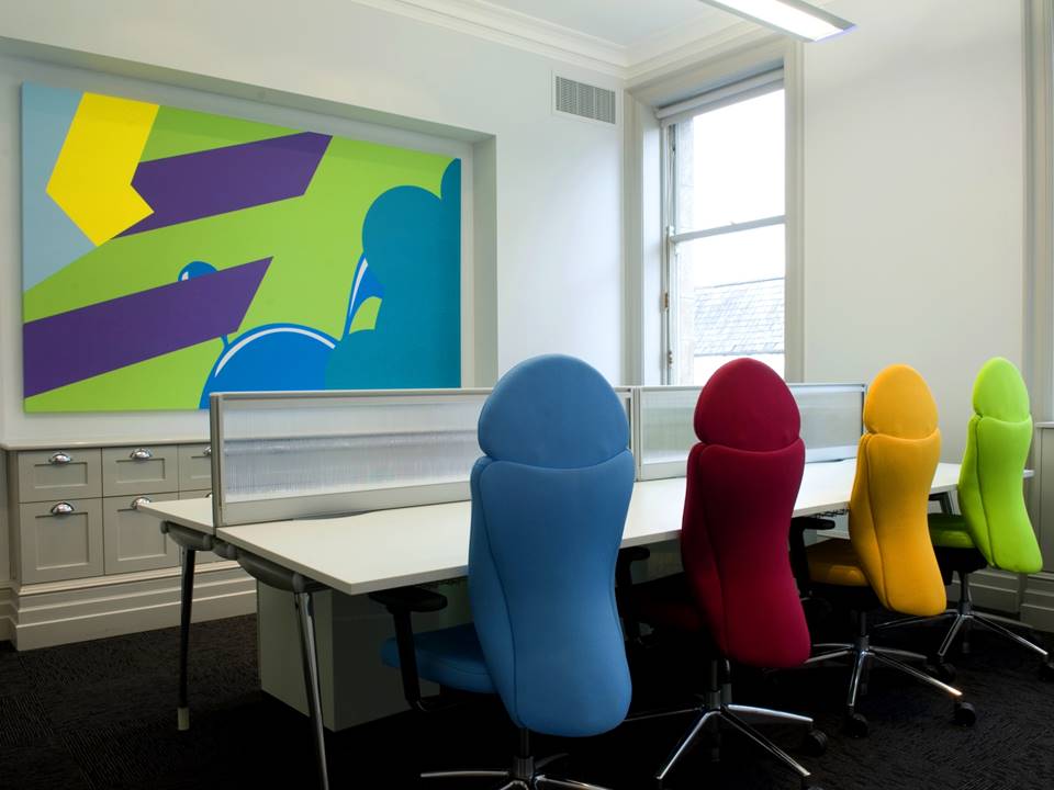
Artwork by AAD.com
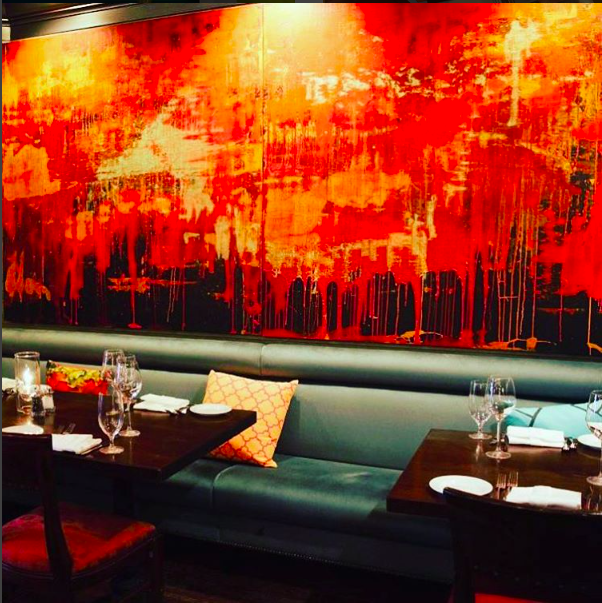
Stage Left, New Brunswick
Our concept here was Gallery + Opulnent + Vibrant, transforming the dining space into a feast for the eyes as well as the tummies!
The Kerns Residence, Dublin
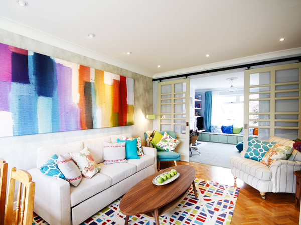
Artwork created by Restless.Design
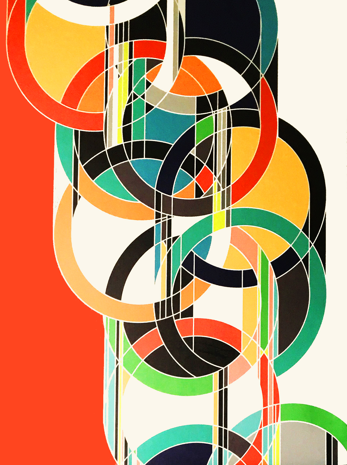
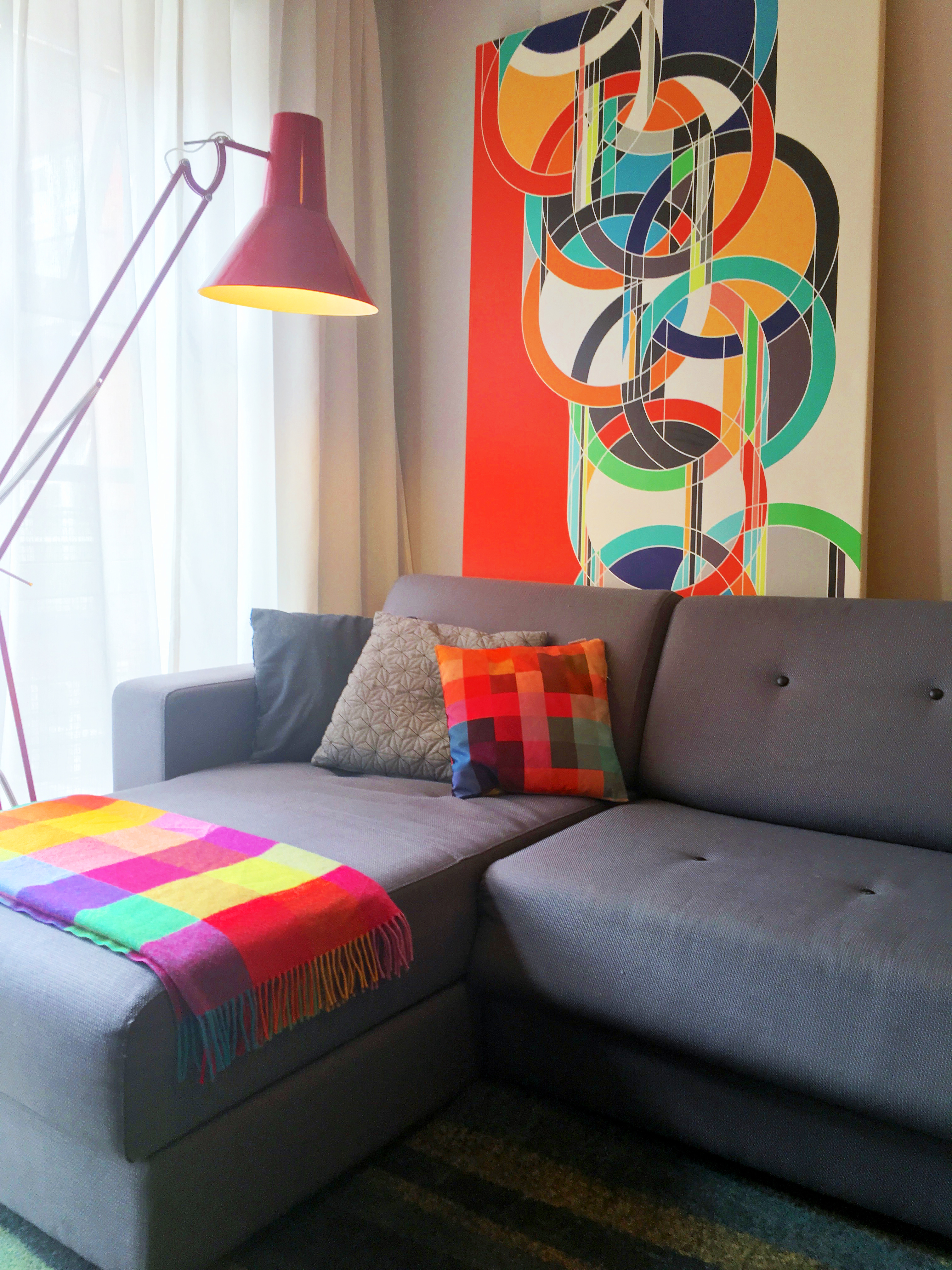
The artwork for the Furey Residence was inspired by the fabulous work of artist Sarah Morris. The brief was bold engaging geometric forms.
Circles & Geometrics Furey Residence, Dublin
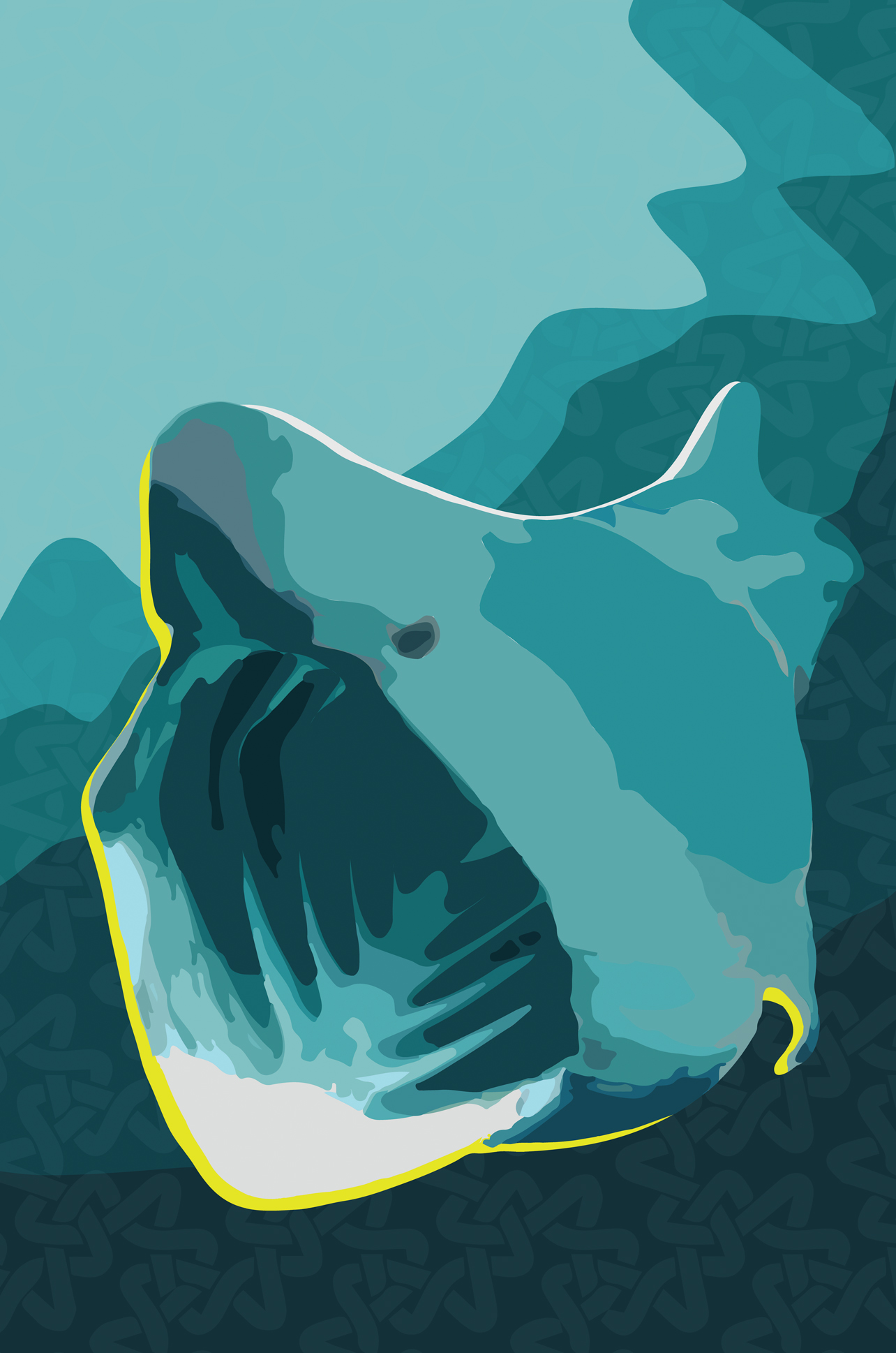
Seamus the Basking Shark at Armada Hotel Ocean Bar
The brief for the Ocean Bar art work was to relate the the Atlantic Ocean. It must feel Irish & rooted in West Clare but be current, unique and engaging. What better than a looming pop art basking shark with Celtic pattern overlays!
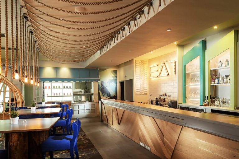
Armada Hotel Ocean Bar, Clare
Source: interiordesign.net / jwt-amsterdam.pr.co / thewilliamnyc.com
By Aoife Rhattigan, Creative Director, Restless.Design
RESTLESS.DESIGN can help you with your refurbishment project.
Please contact our commercial team at 01-4309555 or email: info@restless.design to discuss your requirements with us.
