
All too often we encounter clients with a fear of colour when painting. Our response is….”Don’t worry, it’s only paint!”
It’s simple to change. That being said nobody wants to waste their money & time on something that may not work for them. So before you pick your colours, do your homework. Check out our tips for selecting paint below.
What was that colour again?
- Colour memory is the worst memory.
- Always bring a sample of a colour you like, as a reference when selecting paint. This could be your favourite shirt, a cushion, whatever floats your boat!
- Collect inspiration images as a reference for the colours you like. This can be in a scrapbook or Pinterest board, whatever is easiest.

What do you see……….? I see the light!
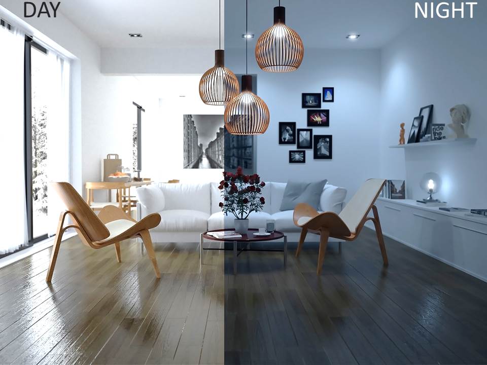
- Choose paint colours in natural light (indirect sun light). This very important.
- Observe how your paint colour changes through out the day.
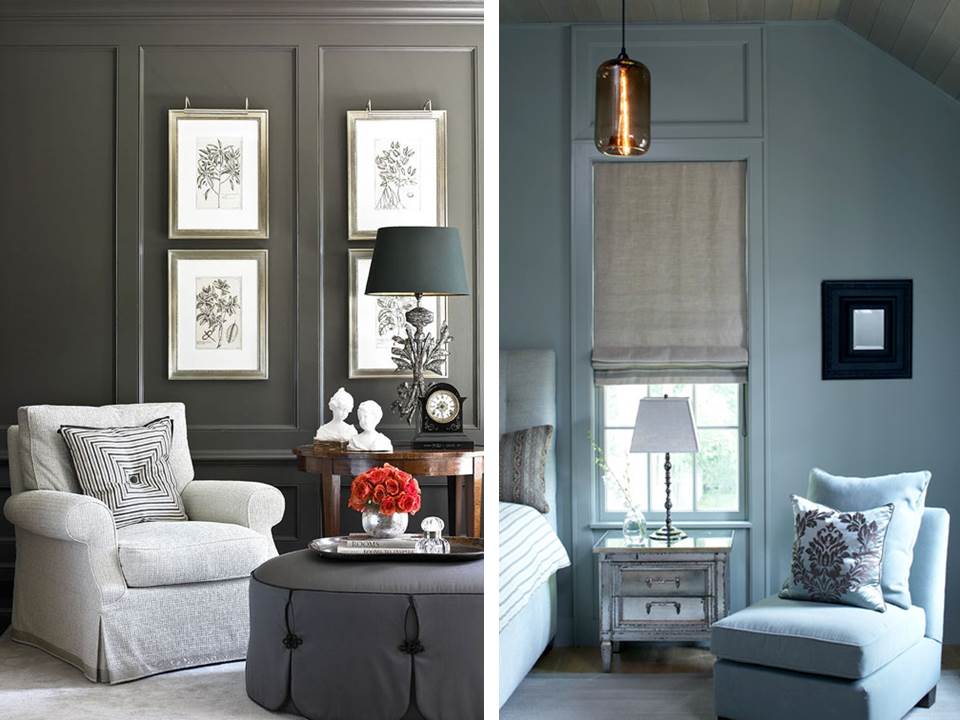
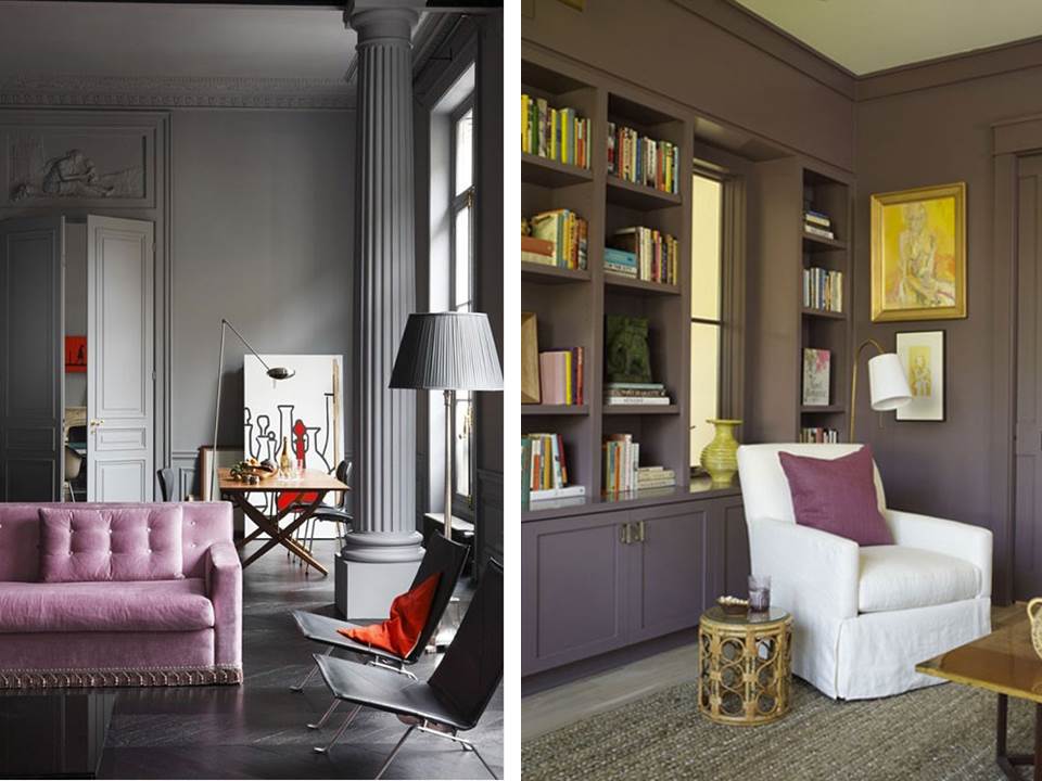
- Darker colours can make a space feel warm and luxurious. Be not afraid!
- Lighter colours can make a space feel fresh and airy – NO beige.
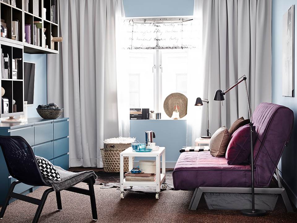
Express yourself…..
- Try new colours
- Have fun with colour you can always repaint.
- Think twice about beige, how about a nice warm grey?
- Afraid of bright colours? Paint one wall with a bright accent colour and a neutral colour for the remaining walls.
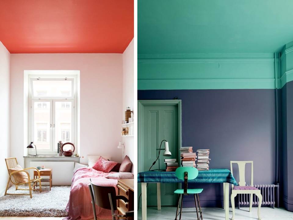
- How about a feature colour on your ceiling… if you dare.
- When choosing a white consider a little pigment to soften the tone.
Now this test won’t hurt!
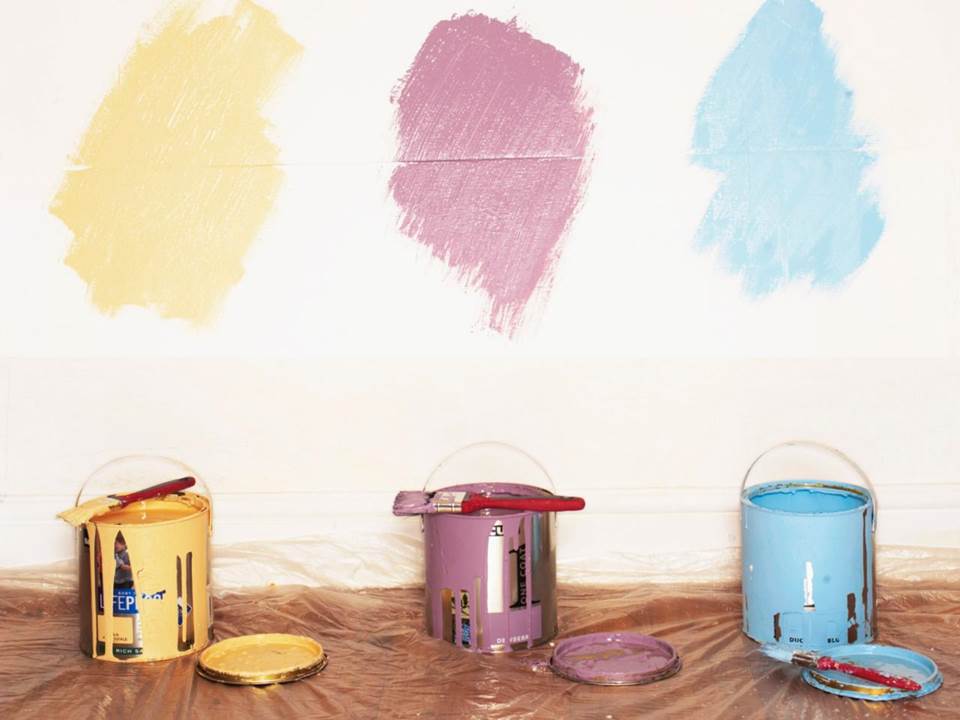
- Always test your paint colours.
- Try to test on a white wall where possible so as not to confuse your eye.
- Paint a large sample, approx the size of a kitchen cupboard door
- Let the paint dry before you make your decision
Cause an illusion with paint!
- How? Paint your skirting and cornice the same colour and create a larger space!
- Color can make you look healthier use a colour that will look good with you skin tone! We can’t all be supermodels!!!
- Darker colors can actually make a space feel bigger, by giving the illusion that there are no corners in the room. Go on, give it a try.
- Darker colors are also forgiving and hide imperfections in a room.
Understand your finishes!
- For skirting, mouldings and wood work use a Satin finish. Its not too glossy which dates but is a durable, easy to clean finish for high impact areas.
- For walls soft sheen or eggshell. This provides a matt look with a wipeable finish.
- For ceilings use a Flat finish. Provides a nice matt look.