Bank interiors have really changed over the years. You may have noticed that’ve started shifting from closed offices and tight counters to bright and open planned spaces. For this blogpost we’ve decided to take a quick trip down memory lane and look at some examples of this shift.
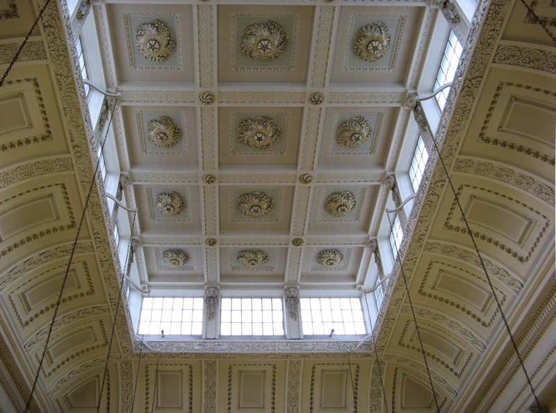
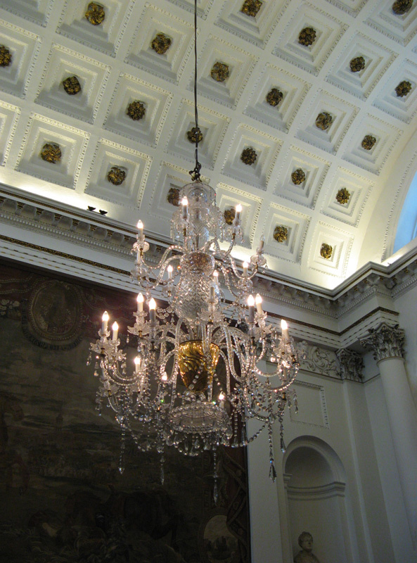
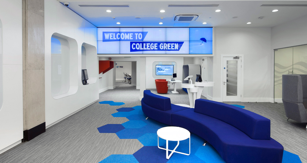
The Bank of Ireland in College Green, once the Irish House of Parliament, is an impressive semi-circular, 6,000 m² building. Walk inside and be taken back by its sheer grandness. All you need to do is look around and see the intricate coffered ceiling and oak panelling. There are also huge tapestries of the Battle of the Boyne and the siege of Derry, and a crystal chandelier dating from 1788.
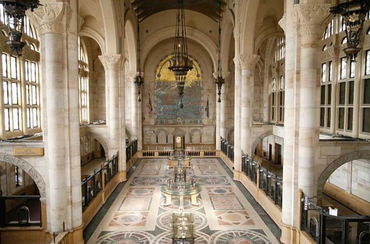
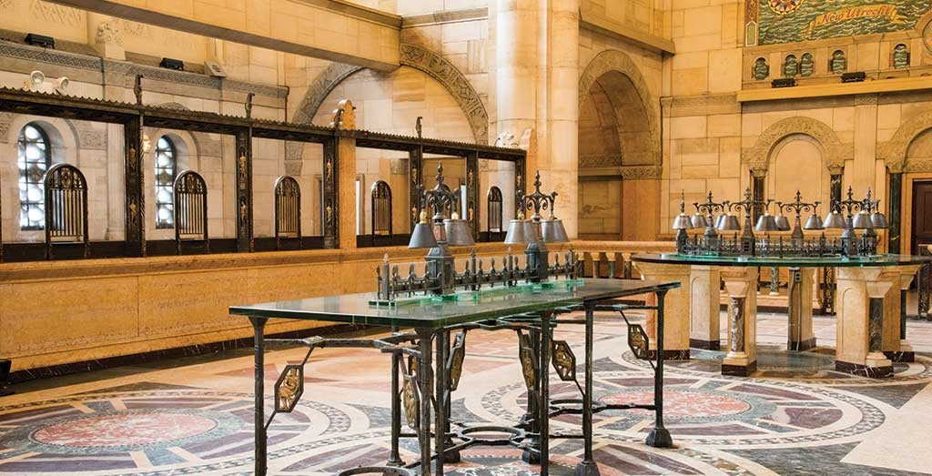
It’s not just Ireland though, many institutes of bank interior grandiose can also be seen across the shore. The Williamsburgh Savings Bank in New York is a prime example and is counted as one of Brooklyn’s architectural icons. It’s also considered one of New York’s most famous interiors featuring limestone and marble facing, mosaics and tinted windows.
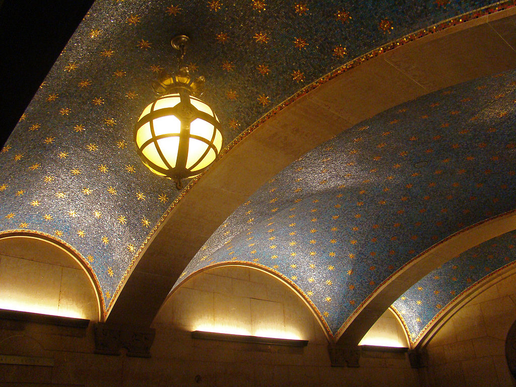
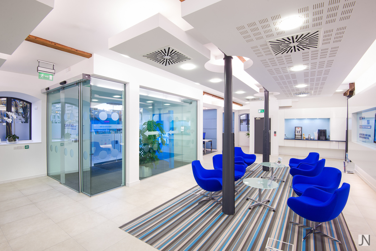
Nowadays, banks have opted for functionality and slick design over grand opulence. With the rise of technology, like currency counters, and automated tellers, there’s less need for human interaction thus decreasing the need for teller counters and offices. Banks are now modern buildings, some almost futuristic looking. Their interiors are innovative, fresh, and airy. The front doors are more locked down now as well with the shift of digital banking within the walls, this is where companies such as https://www.industrialdoorcompany.com/ are contacted to construct safe and secure modern doors for banks and building societies.
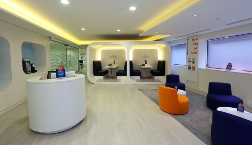
KBC are a good example of this shift in design. A much newer bank than AIB or BOI, KBC have really adopted the minimalist approach. Instead of long lines behind rope barriers, visitors are greeted with large white spaces and comfortable couches and armchairs. Hidden away in the offices behind the scenes are a mix of luxurious herman miller aeron office chairs and other design differences from the grandiose themes of old. Many banks nowadays implement a near clinical look to help with efficiency and cleanliness.
Desks are clean and efficient, oftentimes flexible between sitting and standing spaces, and many who offer office furniture in Brisbane or other locales have been a key part of the design process to ensure that the furniture fits the design and the needs of the employees who work in these new styled banks.
So what do you think? Are you a fan of the repositioning of the modern bank?
Aoife Rhattigan_Creative Director, Restless.Design
RESTLESS.DESIGN can help you with your refurbishment project.
Please contact our commercial team at 01-4309555 or email: info@restless.design to discuss your requirements with us.
